Hi ,
Visualising your data before starting your analysis is a lot like
going to the dentist.
We all know we should do it, and in the long run, will be better off if we do do it. Yet, in the short term, generally things aren't going to fall apart if we don't do it, and there is always something else on our to do list that we would rather
do.
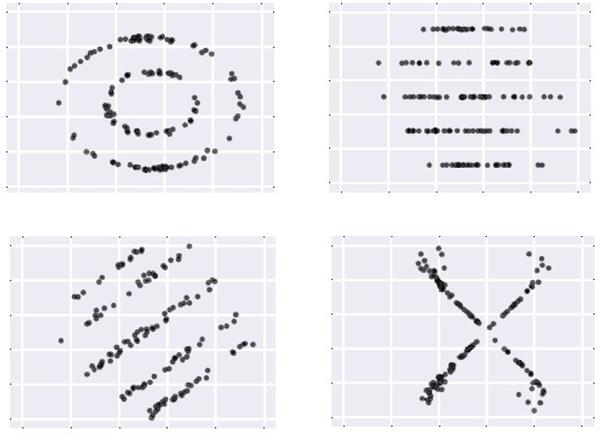
Yet, just like those photos of mouths full of rotting teeth that are designed to scare you into making your next dental appointment, here is a set of (albeit less gross) plots that will hopefully "scare" you back into the habit of visualising your data before performing any modelling.
All the following data sets have the same basic summary statistics (to 2 decimal places):